Blue Meets Green
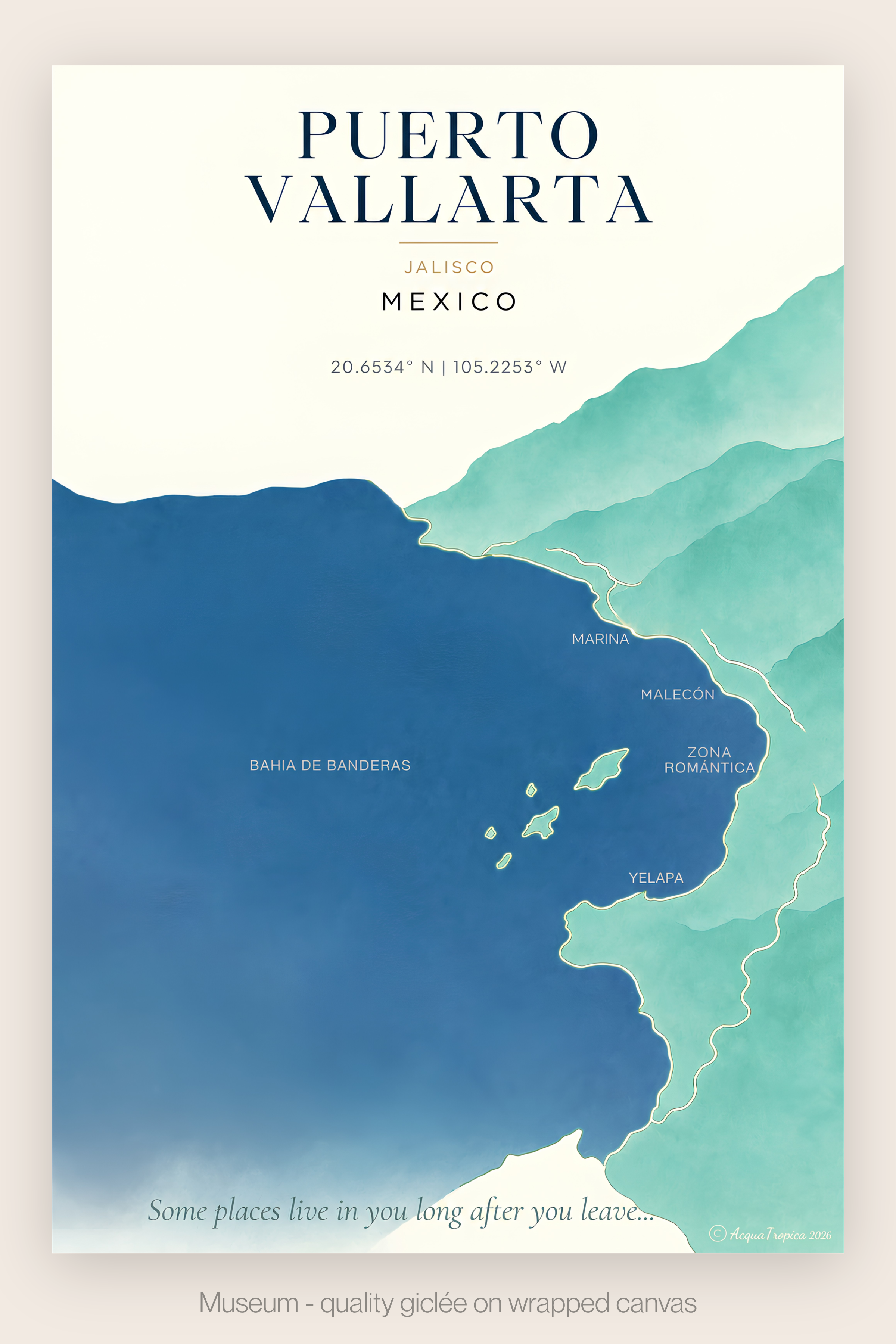
Every AcquaTropica map begins with a question: what does a place actually feel like to the people who love it?
For my first map, the answer was personal. Puerto Vallarta is where AcquaTropica was born.
The bay does most of the work. Bahía de Banderas curves wide and generous, backed by the Sierra Madre mountains dropping straight into the Pacific. I rendered it in a deep, layered cerulean blue, not the flat postcard blue of tourist brochures, but the richer, more complex color the water actually holds at golden hour from the Malecón.
Ask anyone who has visited Puerto Vallarta what they remember, and the green lush environment comes up almost as often as the deep blue water. The Sierra Madre doesn't fade politely into the coastline the way drier destinations do. It presses right down to the shore, dense and lush, a green that feels almost improbable next to that much ocean.
I built the map around that exact contrast: rich, layered green mountainside against deep cerulean bay. Not decoration, but geography. It's the color relationship that makes Puerto Vallarta instantly recognizable, and it's the one detail I refused to soften or simplify away. Taking into account what natural beauty draws people to a beautiful coastline, and what remains with them after they leave, became a founding principle for every coastal map that followed.
Explore the Puerto Vallarta map, and the full Mexican Coastal Collection, in the Gallery.
